This meme was started by Books by Proxy, whose fabulous idea was to compare UK and US book covers and decide which is we prefer. This meme is being nurtured by Lynn’s Book Blog and this week we are featuring FREEBIE covers. I’ve selected Circe by Madeline Miller, which I absolutely loved. And I also love every one of these covers…
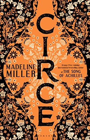 This edition was produced by Boomsbury Publishing UK in April 2018. Isn’t it gorgeous? I love the warm colours that reference the Greek art on ancient pottery and the beautiful title font running from top to bottom of the urn, giving it a strikingly different look. And those flowers with the shading and beautiful detail… I think this is one of my all-time favourite covers and it was this design that prompted me to buy this one. I’m so glad I did…
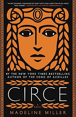 Published in April 2018 by Little, Brown and Company, this is also a wonderfully striking effort. That Grecian face staring out at us, both imperious and slightly sad, draws our gaze. Once again, the warm orange and black colour scheme is both attractive and references Greek artefacts, as does the border detailing. I also like the title font, which works well. However, I do think it’s a shame to clutter this lovely design with unnecessary chatter, compromising the look and feel of the cover.
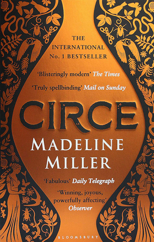 This edition, published by Bloomsbury Publishing in April 2019, is another wonderful design, given it’s a pared-down, less luscious version of the first cover. Once again, the colour scheme just sings out – and I love the Grecian urn with that lovely raised title font. It would look even more stunning if we didn’t, have that wonderful jar-shaped space stuffed with a load of pointless chatter, which despoils this cover more than any of the others, I think. I also love the background, directly referencing some of the ancient Greek figures depicted on artefacts.
 This edition, produced by Pocket in May 2019, is another fabulous effort. A wonderful, subtle design that has stolen my heart. And NO annoying chatter to compromise and detract from the intended visual impact – and doesn’t it just look so much better for it? Not that I’m ranting. At all. Nope. This was so very nearly my favourite…
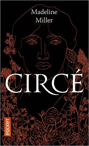
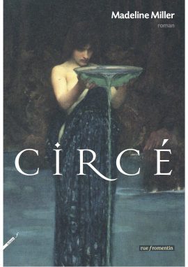 This French edition, published by Rue Fromentin in May 2018, is a bit different from the rest – for starters, it has broken away from the orange and black colour scheme. I love the soft-focus figure offering up a charger, presumably to a god. Though I’m guessing it wouldn’t be Zeus… It’s a beautiful image, the shape of the woman and colouring working well in making this a cover full of mystery. So this is my freebie selection – which is your favourite?

I adore the Pocket edition! It’s mysterious, and the very dark design works so well. Awesome choice!
Thank you, Tammy. It is a wonderful cover, isn’t it? It’s always such a treat when ALLL the covers for a book are fabulous:)
I have the second one on my TBR shelf.
Have you read it yet?
Yes! And I loved it:). I’ve posted a mini-review on Goodreads and Amazon – I’ll be putting together some of my mini-reviews on the blog.
Then I will put this one “next” TBR. TY
I like both of the Bloomsbury covers, this is on my TBR and I know I should read it, just not sure if I actually will though.
It’s a lovely read, Shelleyrae – not overly heavy or difficult… Though right now, I’m very much mood reading – and I’m sure you are, too:))
SJ, I am finding it very hard to choose between the first, three lovely, golden covers – I would be happy with any of them. Sadly, I haven’t read this or The Song of Achilles, which I really must remedy soon!
They are all absolutely fabulous, aren’t they? And yes – both Circe and The Song of Achilles are both stunning reads.
I absolutely love the 2nd cover and it landed on my TBR really just because of that as I’ve never really taken the time to read the blurb! The 1st and 4th are gorgeous as well and I don’t think I had ever seen them.
If you enjoy Greek myth retellings, then you should find this one really enjoyable. Miller’s depiction of Circe as a woman with agency was one of my favourite reads of last year:)). And I’m not surprised that you were promoted to get hold of the book because of the cover – I did the same thing!
Wow, these are all nice. I especially love those first three. Fabulous covers. The first one might be my favorite, but I really love the third one too- yes t the raised font. that looks nice.
Thank you, Greg:). It’s rare that a book has so many really classy covers…
I’m not kidding, I almost went with this one for my freebie was well because the covers are sooooo beautiful! I love the first one too, and I know the 2D pic doesn’t do it justice!
Ah…. well you know what they say about great minds:)). And they are all lovely covers!
The first three covers’ color choice of orange/brown/black makes them the best in your list, and it would have been hard to pick one if not for the raised font in the third one: that’s the detail that turned it into the winner for me… 🙂
Thank you, Maddalena:). Yes – it’s refreshing to see such attention on the title font – I’m always surprised at how neglected title fonts often are… But you’re right about the colour – it’s a wonderful combination…
I certainly agree with your choice, Sarah…the outline of the urn but those beautiful, lacy flowers!!!
I know… aren’t they lovely?
I love all the covers. But my favorite is the Bloomsbury 2018. I’m a sucker for flowers and other plant material on covers.
Yes… they always make a cover look so pretty, when done well, don’t they?
Yes they do. 😎
All of these are beautiful so it’s hard to pick, but I lean towards the third one. It’s simple lines are elegant. My least favorite is the last one. I can’t really explain why but it’s very different from the others and seems off a bit for me.
The last one is different – I do wonder if it is the comparison of the other very strong offerings is why the reaction is a bit tepid. And you’re right, the third one is awesome:))
Yes, I think seeing the others really flavored me against the last one. It might be fine, if I hadn’t seen the others. Thank you for your agreement on my love of the third one!! It is very beautiful! I love the raised lettering. Very clever!
These covers are beautiful. I think I love the first one most though. Even though I haven’t read it, I ordered the UK book because of how it looked.
Oh I do hope you enjoy it, Kristi:)
Thank you!
I know, I know, I know I should read this book some day! 🙂 I’m so used to seeing the face everywhere, so those other covers are very refreshing! A pity about that jar-shaped one, as you’re right–it’s got such an elegance to it. They may as well pulled a Disney Hercules and turned all the blurbs into Greek-ish lettering. 🙂
Isn’t it massively ANNOYING??? Yes – I’m not going to nag – I’m just full of awe that anyone with a child under 7 manages to read, never mind write. I couldn’t… Thank you for swinging by, my friend…
I’m happy to visit when I can! xxxxx
And a blessed Easter to you in case I don’t catch you before tomorrow!
A very Happy Easter to you, too. And I hope you and yours stay safe and healthy!