This meme was started by Books by Proxy, whose fabulous idea was to compare UK and US book covers and decide which is we prefer. This meme is being nurtured by Lynn’s Book Blog and this week we are featuring FREEBIE covers. I’ve selected Circe by Madeline Miller, which I absolutely loved. And I also love every one of these covers…
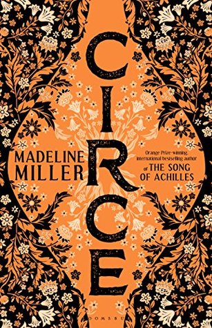 This edition was produced by Boomsbury Publishing UK in April 2018. Isn’t it gorgeous? I love the warm colours that reference the Greek art on ancient pottery and the beautiful title font running from top to bottom of the urn, giving it a strikingly different look. And those flowers with the shading and beautiful detail… I think this is one of my all-time favourite covers and it was this design that prompted me to buy this one. I’m so glad I did…
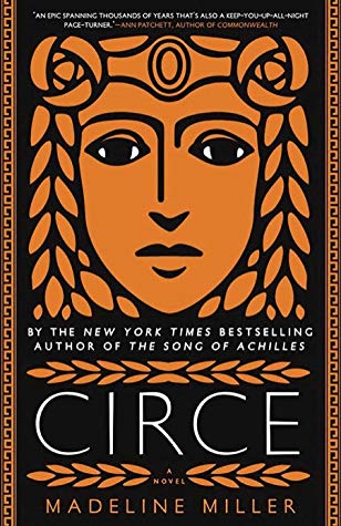 Published in April 2018 by Little, Brown and Company, this is also a wonderfully striking effort. That Grecian face staring out at us, both imperious and slightly sad, draws our gaze. Once again, the warm orange and black colour scheme is both attractive and references Greek artefacts, as does the border detailing. I also like the title font, which works well. However, I do think it’s a shame to clutter this lovely design with unnecessary chatter, compromising the look and feel of the cover.
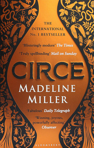 This edition, published by Bloomsbury Publishing in April 2019, is another wonderful design, given it’s a pared-down, less luscious version of the first cover. Once again, the colour scheme just sings out – and I love the Grecian urn with that lovely raised title font. It would look even more stunning if we didn’t, have that wonderful jar-shaped space stuffed with a load of pointless chatter, which despoils this cover more than any of the others, I think. I also love the background, directly referencing some of the ancient Greek figures depicted on artefacts.
 This edition, produced by Pocket in May 2019, is another fabulous effort. A wonderful, subtle design that has stolen my heart. And NO annoying chatter to compromise and detract from the intended visual impact – and doesn’t it just look so much better for it? Not that I’m ranting. At all. Nope. This was so very nearly my favourite…
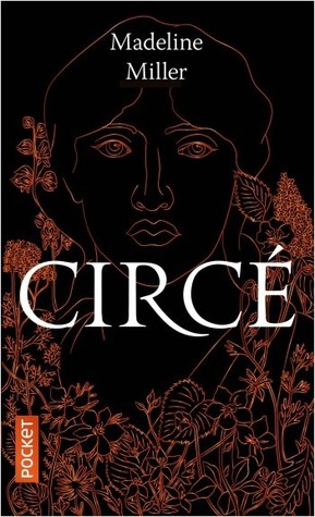
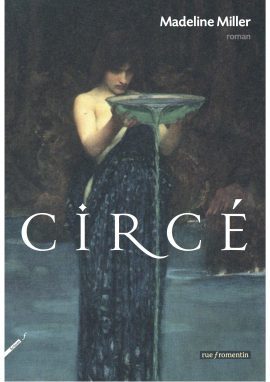 This French edition, published by Rue Fromentin in May 2018, is a bit different from the rest – for starters, it has broken away from the orange and black colour scheme. I love the soft-focus figure offering up a charger, presumably to a god. Though I’m guessing it wouldn’t be Zeus… It’s a beautiful image, the shape of the woman and colouring working well in making this a cover full of mystery. So this is my freebie selection – which is your favourite?
