
This meme was started by Books by Proxy, whose fabulous idea was to compare UK and US book covers and decide which is we prefer. This meme is currently being nurtured by Lynn’s Book Blog and the theme this week the theme to feature on any of our covers is steampunk. I’ve selected The Affinity Bridge – Book 1 of the Newbury and Hobbes series by George Mann, a cracking whodunit set in an alternate Victorian London…
 This edition was produced by Snow Books in 2008 and is my favourite. I love all the detail and the bright colours. It’s beautiful, full of lovely little touches, like the London cityscape, the little steampunk flourishes and that fabulous airship, which is the template for nearly all the other versions of this book’s covers. While I’ll accept that it probably doesn’t stand out when in thumbnail, I’ll forgive that – who wouldn’t want to expand this cover into glorious full size to capture the full effect?
 Published in April 2010 by Tor Books, this is another attractive, well-designed offering. The airship is now grungier and less shiny, though every bit as eye-catching. I love the border and the attention to detail, again. I just wish there was less chatter across the cover.
 This edition, published by Titan Books in July 2015, is certainly bright. The airship is still there and this cover provides lots of detail, but in silhouette. I think the overall effect is successful and eye-catching and I’d probably love it more if I hadn’t already given my heart to the Snow Books effort.
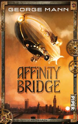 This edition, produced by Piper in 2011, takes the original design and makes it their own. It is far more stripped back and I think it is extremely effective – I love the background colour and clever use of the clouds to provide a suitably dramatic backdrop for that magnificent airship. The border is also nicely handled and in thumbnail, this one really pops. This is my second favourite, mostly because I just love that colour…
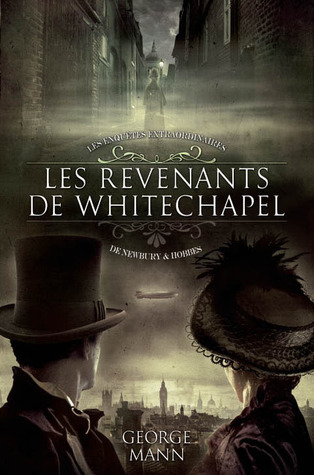 This French cover, published in June 2011, takes a completely different approach. This is the foggy London where Jack the Ripper lurks along with other desperate villains and only the likes of Newbury and Hobbes can get justice done… We see the two protagonists featured on the cover. I do like this effort, though not as much as the others. What about you – which is your favourite?

I agree with you and my second choice would be the Titan cover though they are all pretty good.
They are all good, aren’t they? I was delighted by the quality across all the versions…
Not a big fan of steampunk, but out of the covers pictured, I like the TOR 2010 one.
It’s not to everyone’s taste… and some of it can be less tongue in cheek and charmless than other offerings. I was very taken with the Tor cover, too. But I’m something of a colour junkie…
I’m hard pressed to pick a favorite. It’s been the first two and the fourth one. I’ll go with the fourth one.
That is a fabulous colour, isn’t it? Have a great weekend, Laura!
I think the Piper edition is my favorite, I love the colors and it feels the most atmospheric. Great choice, Sarah😊
Thank you, Tammy:)). I really enjoyed sifting through the contenders in this genre. And that Piper edition is lovely – but I first read this one with the Snow Books cover, which has probably influenced my choice.
All covers look good , but I think the 2nd one appeals to me the most
They are all good – I think it comes down to personal taste this week, Rash, so I’m fascinated to see what everyone chooses. Thank you for popping by:)
Actually, I kind of think they’re all good. Thanks to you, I have discovered steampunk, and am developing a real appreciation for it. (Before I read your blog, I had never heard of it. Is it slow catching on in the US? I have only seen one TV series that featured it here on US TV.) All of the covers alert you to “Steampunk book ahead!”
Thank you, Rae:). As it tends to hark back to a Victorian England when this country was at the height of its influence, despite having many serious social inequalities, I think this is a sub-genre that does have more Brit appeal. Although there are a number of best-selling US writers who write steampunk…
I love the Tor cover, but the French one may be my favorite. I love the dark color scheme; it has an air of mystery to it.
Which is entirely appropriate to the story:)
I like the French cover, it would have made me click to read the synopsis. All of these have elements I love.
Thank you Kimberly – I was really pleased this week that there wasn’t a single cover that I didn’t like:)
I love your choice but for some strange reason the Tor version really appeals to me – I totally agree with your comments about the chatter, but I still just really like it.
Lynn 😀
Do bear in mind that I have a bee in my bonnet about chatter on covers! And other than that, it is a fabulous cover:))
Oh definitely, your choice is the winner for me too, hands down. Though I do love the dark atmosphere of the French cover!
Yes – I loved the brooding atmosphere, which actually suits the book very well.
These are all really good covers! Thats a tough choice but I think I like the Piper 2011 cover best!
Yes… it was my second favourite – I just love that Snow Books effort, though…
The Piper edition is the one that most catches the eyes: you are right in stressing the masterful use of color: sunset hues are always my favorite… 🙂
It is a fabulous colour, isn’t it? And, like you, I do love those colours on books – so uplifting!
Oh nice pick! I think the second one is my favorite, but the other ones are all quite good too. And I like how the airship is part of all the covers. The last one does seem to have a different vibe form the others, which seem more closely together in the vibe the cover gives.
Yes – though to be fair, the vibe from the French cover does nicely fit the tone of the book, which is quite dark – though there isn’t too much gore or nastiness.
Oh, I’m with you, Sarah!! I LOVE the Snow Books cover the most!! However, I also really like the others. So I have to say that the Snow Books cover is my ABSOLUTE FAVORITE, but all the others are beautiful “runners-up”!! Lol. With a little book madness, I can see myself wanting to own ALL of these editions! LOL.
Thanks for featuring these beauties!! HUGS!! ❤ ❤ ❤ 🙂 🙂 🙂
I’m glad you like them so much, Maria, knowing how much you appreciate lovely covers:). I was delighted to run across these which worked really well for this week’s theme. Have a lovely week!x
Gosh darnit, I can’t pick! Even the grungy airship cover has that neat detail of the ladder twisting in the wind behind the author’s name. (sighs, adds yet another one of SJ’s finds to the TBR list because she’s the ultimate reader of awesomeness)
Yes – this is a really cool series, Jean:)
It’s hard for me to pick a favorite (except for dropping the last one from the contest because it feels “meh” at best). I love Snow Books’ and Titan’s renditions for the clearly Victorian feel, but the more contemporary-feeling ones by Tor and Piper are also very eye-catching.
There are a number of cracking covers here, aren’t there? I think George Mann is very lucky to have such fab covers.
Indeed. It also makes me regret so many great authors aren’t that lucky…
Yes – there are some real shockers out there!