

This meme was started by Books by Proxy, whose fabulous idea was to compare UK and US book covers and decide which is we prefer. This meme is being nurtured by Lynn’s Book Blog and this week we are featuring covers with WORDS. I’ve selected Artemis by Andy Weir and linked this post to #Sci Fi Month 2020. See my reviews of The Martian and Artemis.
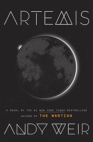
This hardcover edition was produced by Crown in November 2017. To be honest, I think it’s just dreary. The story is a foot-to-the floor thriller set on the Moon. And with all the black, black, blacketty black going on, I don’t think you’d know it. Worse – in thumbnail both the author and title fonts simply disappear. I think this cover fails on almost every level.
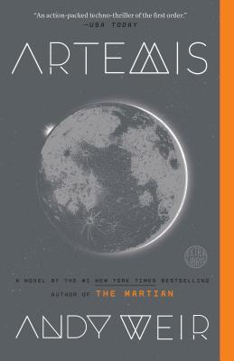
Published in July 2018 by Ballantine, at least this grey effort gives us an idea of the Moon. And though I’m not sure exactly why it’s there, I quite like the orange strip running down the length of the cover. Though perhaps I’m just craving something – anything else, other than GREY.
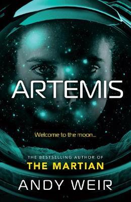
At least this edition, published by Del Rey in November 2017, is an improvement over the previous miserable offerings. Though I can’t help thinking the girl staring out at us through her space helmet is a not-very-subtle reminder that this is the author of The Martian, given that one of the default covers was Matt Damon was gazing at us. And just in case we missed that allusion, there is lump of blurb telling us. Which has ruined this one for me.
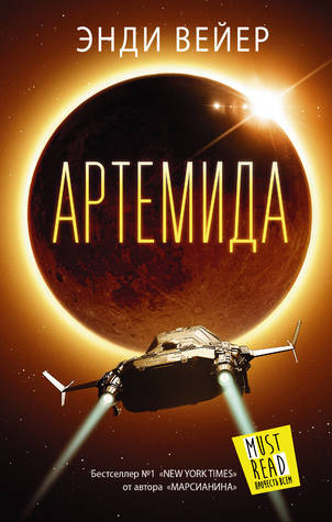
This Russian edition, produced by ACT in December 2017, is more like it! I love this image of the Moon, limned around the edge by the Sun. It is glorious and gives a wonderful pop of colour and excitement. And there is also a cool spaceship in the foreground… While I could have done without the MUST READ docket hanging off the ship exhaust, this is my favourite cover by a long light year.
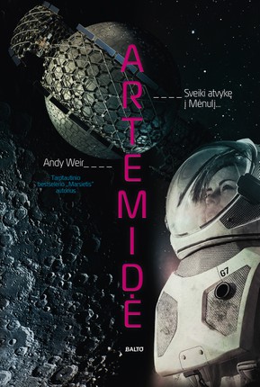
This Lithuanian edition, published by BALTO leidybos namai in August 2019 is also a better effort than the top two miserable efforts. I like the figure against the craters of the Moon, though the scale and detail is slightly puzzling. And I definitely like the title running down the centre of the cover in red lettering. But which is your favourite?


