
This meme was started by Books by Proxy, whose fabulous idea was to compare UK and US book covers and decide which is we prefer. This meme is currently being nurtured by Lynn’s Book Blog and the subject this week SOMETHING SWEET has to feature on any of our covers, so I’ve selected Friends, Lovers, Chocolate – Book 2 of Isabel Dalhousie series by Alexander McCall Smith.
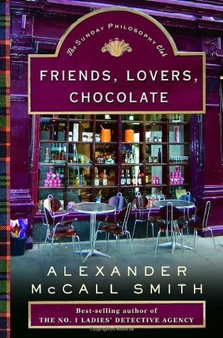 This edition was produced by Pantheon Books in September 2005. I like the design – the colourful shop front and pavement café looks delightfully enticing. But that horrid textbox slapped across the top blocks out far too much of the design – and given the café is at a slight angle and the textbox isn’t, the resulting clash of perspectives is jarring. If only it hadn’t been there – this one would definitely have been my favourite… *sigh*.
 Published in August 2006 by Anchor Books, this cover is harking back to the past. The plain bright yellow really pops and I like the contrast with the chocolate brown for the borders, artwork and text, which gives it a classic feel. The touch of tartan and the dramatic hand dropping the cup of chocolate all give appropriate clues as to what the book is about. I really like this one.
 This edition, published by Abacus in July 2006 has also gone for the vintage vibe. The bold, blocky artwork, strong primary colours and clear, capitalised text all refer back to the mid-20th century and the heyday of the whodunit. This is another strong candidate for this week’s favourite – I really like this one.
 Produced by Little Brown in 2005, this is my favourite. I love the artwork, the chocolate drink, the rather natty glove draped over The Scotsman newspaper – all very nicely done. The lavender sprigs down the side also provide further eye appeal.
 This French edition, published by Editions des Deux Terres in September 2013 is another strong contender. I love the image of the delicious chocolate cake with the single bite taken out of it – somehow more effective than a pristine slice. And while I’m not a fan of plain white backgrounds, this time it really works. I also think the lettering, both of the author and title is attractive and effective. Which is your favourite?

The last one. The French cover … It makes me hungry , and I love it
Yes… it was a very close contender:)
The first one is my favorite, with the 2005 Little Brown being a close second.
I love the first one but you’re right about the font and perspective. I think I could get past the font if it wasn’t a generic stark white but it just doesn’t look quite right. I think we have the same favorite and now you’ve got me wanting to find the book! I love the title.
I have read the first couple and quite enjoyed them – but I don’t think they compare to his other series – The Number One Ladies’ Detective Agency – have you read those, Katherine?
I think they could have done so much more with the covers for this book! I’m going to have to go with the first one, but I agree, the text box is horrible.
I’m so glad I’m not the only one who thinks that wretched text box is a blight! And yes – I agree that the covers are all somewhat meh – especially when you think of the lovely covers for his other series The Number One Ladies’ Detective Agency…
I think this has to be the widest arrange of styles I’ve ever seen for one title! And I’m torn, too. Each cover evokes something different to me–from sweet to whimsy to down right dramatic. Do you see this happening often?
Not quite to this extent… but the variation in covers for some titles is startling.
I sort of like the first cover, but it would have worked much, much better if they had managed to make the title look more like that shop’s front sign: it would have turned this design into something quite lovely…
Yes! That’s exactly what I thought when I first saw that textbox…
Even with the jarring text box, I prefer the top version of Friends, Lovers, Chocolate.
You’ll probably hate me for this, but I don’t like ANY of the covers very much. The title has such potential, but I would not buy any of these based on the cover appeal.
Love the 2006 one with the vintage vibe.
Great choice – I like your favourite but, because it makes me so hungry I’m going with the first cover – although I do agree with your issues.
Lynn 😀
lol… that is a problem:)
Urg! I really love the color of the bookshop on the first book, it is gorgeous! But, like you said the title text box is awful! And its not even the same purple! And Crooked! So I have to agree with your favorite.
I’m glad that text box has grated with you as much as it annoyed me!
The first one attracted my eye, but as I scrolled down and go to the one you selected, I actually said, “Oooooo” so that is the winner. I totally agree with your choice.
There are times when a cover just speaks to you, doesn’t it?
Absolutely. I often choose my books because of the cover, at least they pique my interest to look closer.
To be honest, I find the text box on the first one quite interesting, because it almost (ALMOOOST 😦 ) looks like it’s a part of the picture and the shop’s actual banner. But because of the execution (the picture is slightly angled while the box is not) the impression is ruined.
I would have liked your favorite much more if it didn’t have a random bar of lavender design which squished the actual composition and title to the right. I can guess the designer’s intent behind it, but I feel the execution made it fall short.
And though I have mixed feelings about white backgrounds as well, I do agree that the last cover uses it well. Overall, it’s catching and appealing.
It’s always lovely to get your feedback, Joanna, as you are looking at covers with your designers eye. Thank you for taking the time to explain your thoughts – it’s much appreciated:)