
This meme was started by Books by Proxy, whose fabulous idea was to compare UK and US book covers and decide which is we prefer. This meme is being nurtured by Lynn’s Book Blog and this week we are featuring covers depicting POTIONS. I’ve selected The Potion Diaries – Book 1 of The Potion Diaries series by Amy Alward.

This offering was produced by Simon & Schuster in July 2015 and is the default cover. It certainly ticks all the boxes – the title is clear with a quirky font and the whole design is straightforward and gives a strong sense of the genre. But while I think it’s okay – I don’t love it, or even particularly like it. It just doesn’t speak to me.
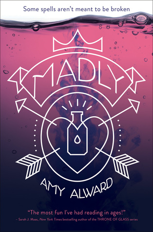
Published in September 2015 by Simon & Schuster, this hardback edition – rather unhelpfully – has been renamed. My guess is that it is referring to the film, Truly, Madly, Deeply. As a design, I think it works really well. I love the rich pinks and purples of the potion-effect backdrop, which allows the thin, scratched-out effect of the design and lettering to really pop, even when in thumbnail. While I admire this offering, and think it’s clever and apt – this cover isn’t my favourite, though it comes mightily close.

This Spanish edition, published by Nocturna in March 2016, is using the classical idea of potent potions as the main reference. The hand, wreathed in ominous smoke and vivid lightning is dramatic and beautiful – but although the nails are wearing nail varnish, I’m still unsure if the tone of this cover gives a sufficiently modern vibe. That lettering looks far too like something from Arabian nights. That said, I’m aware it’s more of a niggle and this one is a close contender.

Cbj, the German publishers for this edition in July 2016 decided to go all out for the cute and feminine, hoping it would appeal to their YA readership. Could it be any pinker? Blossoms… a heart-shaped bottle – and just in case anyone didn’t get that it is aimed at a young, female audience, they also threw in some gold sparkles, too. I don’t think anyone told the designers that less is more… That said, it’s very pretty – but I’m guessing from the blurb, the book is a bit more edgy than this Disney-princess treatment might suggest.

This Czech cover is a far darker take on the story. Published in March 2018 by Talpress, this cover is clearly set in a laboratory. I love the details of other bottles and that tap in the background, while the trapped mermaid glowing in the glass is beautiful and eye-catching. Normally, I’m not a fan of textboxes, but given that this one is so clearly designed as a label to place on a bottle – it gets a pass. This is my favourite – I think it’s attractive, punchy and very well done. Which one do you prefer?

Pingback: The Friday Face-Off: Hubble Bubble – Books by Proxy
I think the Simon & Schuster – September 2015 cover is my favourite. It’s quite a modern cover and I love the combined symbolism and typeface… but how utterly bizarre to rename the book!
I know! I don’t know if it initially was going to the UK name – but whatever happened, it didn’t stick!
I completely agree, the Czech cover is my favorite too, and the mermaid in the bottle makes me so curious!
Yes – I’m not sure about the mermaid in the bottle. But then, I haven’t read this one…
I like the modern look of the first one for this target audience. For an older audience (with a different story?) I’d love the last cover minus the mermaid:)
Yes – I think you’ve hit the nail on the head, Becky. I’m not the target audience for this book, anyway, so it’s not surprising that one of the covers specifically designed for said audience failed to interest me…
Hi Sarah! This seems like a fun read. All these covers are actually really nice, quite diverse.
I think I like the German one most. But that’s only based on the cover and the cover should remain true to the book. So your choice is the winner by far.
Happy weekend and thanks for visiting us.
You’re welcome, Mareli – it’s always fun swinging by your place. Stay warm!
Just at first glance I’d pick the Spanish cover.
It is very pretty…
I saw this book featured on another FF and the first thing I thought was, how precious are these covers?! While I agree the first cover isn’t that impressive, I saw a version of it where the potion was pink – that was actually my favorite!
Is that the second one where the title has changed, Mogsy? It is a very clever cover on all sorts of levels – and was certainly a contender.
I agree with you that the Czech cover is the most eye-catching and intriguing. The first cover is very pretty but it doesn’t stand out or make me want to know more, whereas the Czech cover does. It’s fascinating how different all the covers are from each other.
I always enjoy Friday Face-off because I’m fascinated to see how much variation on covers you can get on a single title:)
I definitely like the first one!
Thank you for swinging by, Jennie:). It’s certainly a strong, well designed cover – that’s why it’s the default…
Always a pleasure, Sarah!
Love your pick! 🙂
Thank you, Kristi:))
You’re welcome!
I really like your favourite – and would you believe I also like the pink version.
Lynn 😀
Oh, it’s adorable! I’m more than partial to gold glitter and everything… I was brought up on Barbie and LOVED her:)))). But I think this story is a bit edgier than the pink cover suggests…
Oh good lord, that pink one. I half-expect the “I Dream of Jeannie” theme to play when I look at it. That first cover is one step up from that, with the quirky font and cute bottle, but these elements totally clash when I read “hunt” on the blurb. I know romance can be a bit of a hunt, but I just can’t shift my thoughts of that word into a lighter realm, if that makes sense.
In short, I agree with your selection, lol 🙂
Lol… and now I won’t be able to think of anything other than “I Dream of Jeannie” when I see the pink one, either:))).
HAHAHA! My work here is done xxxxxx
:)))xxx