This meme was started by Books by Proxy, whose fabulous idea was to compare UK and US book covers and decide which is we prefer. This meme is currently being nurtured by Lynn’s Book Blog and the subject this week featuring on any of our covers is EXPLOSIONS. I’ve selected Cibola Burn – Book 4 of The Expanse series by James S.A. Corey – see my review of Leviathan’s Wake. I’ve also linked this week’s meme with @SciFiMonth2019, given this epic space opera series is such a success.
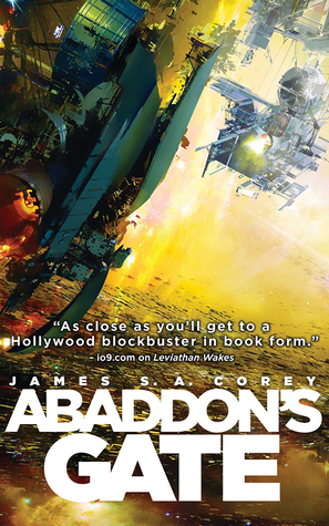
 This edition was produced by Orbit June 2014. I love the big, blockbuster feel of this cover, which really suits the feel of this large-scale epic space opera series. This is the default cover from which many of the others are derived – and with good reason, given the drama it engenders. I also like a punchy orange title font and the large blocky design, giving a slightly retro feel to the book design. This is my favourite – it looks good both full-sized and in thumbnail.
 Published in November 2018 by MAG, this Polish edition has opted for a completely different feel. Gone is the large space station, the flaming debris from a disintegrating ship – we don’t even have a distant nebula or starscape to relieve the ink-black background. There is just a drifting astronaut with a bunch of cables… In thumbnail, you cannot make out what is going on – and given this was only released last year, that is a fundamental error. The feeble font is all but eaten up by that black background and certainly doesn’t prevail once the cover is shrunk. I think this is bleak and boring.
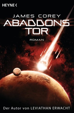
 This Serbian edition, published by Laguna in June 2016, is more like it! I love the way the central artwork is highlighted with that dramatic red backdrop, so those tentacles waving in the air take centre stage. The lightning streaking through that awesome title font is also a lovely touch, as it the nifty little shuttle perched on the rocky outcrop off to the left. Overall, I really like the eye-catching drama of this offering – a huge improvement on that previous dreary effort. It is so nearly my favourite…
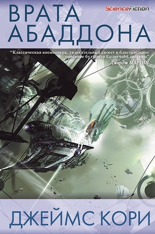
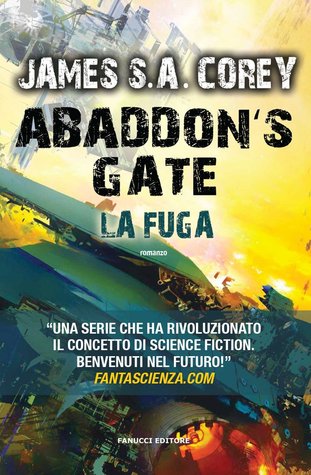
 This Italian edition has gone back to the original cover for inspiration, enlarging that exploding piece of space debris and making the title a bit funkier. I think this gives the cover extra visual drama, as that blazing explosion really stands out, but it is at the expense of the monumental scale of the original cover, which I think works better. Though it’s SUCH a close-run thing… ask me tomorrow and I’ll probably vote for this one, instead.
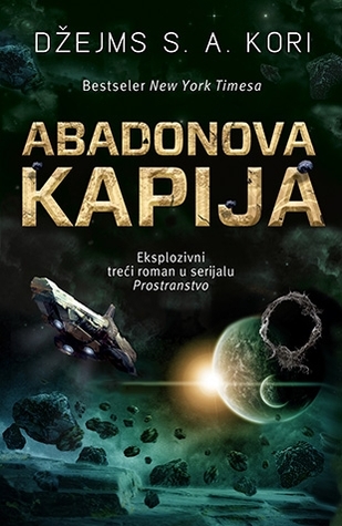
 This Russian edition, published in June 2018 by Эксмо: fanzon is also another cover which offers an epic overview of a dramatic space battle. The colours are more muted, but I love the artwork and I think the scene is beautiful. The detail of the dreadnaught in the centre of the cover is fabulous. However, while I absolutely love it as a piece of artwork, I don’t think it ticks enough boxes as a cover. In thumbnail, once again, it’s too dark. And the title and author fonts fail to sufficiently stand out. Which is your favourite?