
This meme was started by Books by Proxy, whose fabulous idea was to compare UK and US book covers and decide which is we prefer. This meme is currently being nurtured by Lynn’s Book Blog and the theme this week features riders. I’ve selected Green Rider – Book 1 of the Green Rider series by Kristen Britain. I read this one longer ago than I care to recall, but thoroughly enjoyed it.
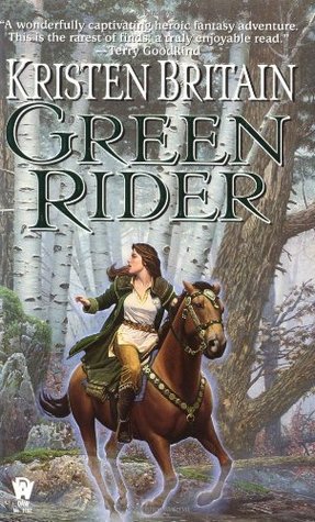 This edition was produced by DAW Books in April 2000. I love this cover – the wealth of detail with all the movement and drama of the galloping horse is beautiful. But I do dislike all that chat at the top which draws the eye away from the author name.
 Published in April 2011 by Gollancz, this one is my favourite. Yes… I don’t think the horse has wings in the book, but to be honest – I don’t care. The illustration is absolutely stunning and just works. My one niggle is that the title and author fonts could be just a bit more decorative as they are unutterably dull.
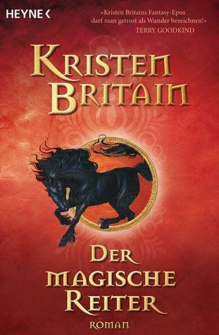 This German edition, published by Heyne in December 2008, is attractive and eye-catching. And if you are wondering why there isn’t a scrap of green anywhere, the German title translates as The Magic Rider so it makes sense to have a striking red cover featuring a beautiful black stallion galloping through the middle of the cover. At last the font also is suitably dramatic.
 This Turkish edition, produced by Kalipso Yayinlari is more about the young rider than the horse. When I saw the teeny-tiny version of this one, I confess that I sighed a little, but now it is larger, I like it more than I thought I would – though I’d prefer her to be wearing gauntlets and less eye makeup. But that sword hilt is gorgeous and I love the wonderful title font.
 This Czech cover, published in 2012 is another strong contender. In fact, if it wasn’t for that amazing Gollancz offering, this would be my favourite. I love the fact that we are seeing the back of the rider and the horse, while that rich border gives it a suitably otherworld flavour. I love the golden light that effectively throws the rider and horse into relief, though I would personally have used a different colour other than yellow in the title font. What about you – which is your favourite?
