
This meme was started by Books by Proxy, whose fabulous idea was to compare UK and US book covers and decide which is we prefer. This meme is currently being nurtured by Lynn’s Book Blog and the theme this week features riders. I’ve selected Green Rider – Book 1 of the Green Rider series by Kristen Britain. I read this one longer ago than I care to recall, but thoroughly enjoyed it.
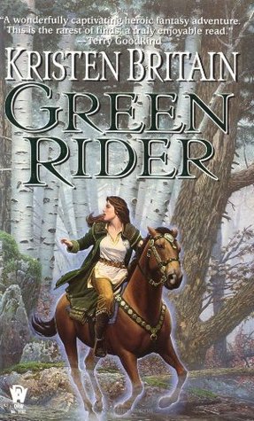 This edition was produced by DAW Books in April 2000. I love this cover – the wealth of detail with all the movement and drama of the galloping horse is beautiful. But I do dislike all that chat at the top which draws the eye away from the author name.
 Published in April 2011 by Gollancz, this one is my favourite. Yes… I don’t think the horse has wings in the book, but to be honest – I don’t care. The illustration is absolutely stunning and just works. My one niggle is that the title and author fonts could be just a bit more decorative as they are unutterably dull.
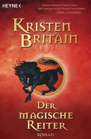 This German edition, published by Heyne in December 2008, is attractive and eye-catching. And if you are wondering why there isn’t a scrap of green anywhere, the German title translates as The Magic Rider so it makes sense to have a striking red cover featuring a beautiful black stallion galloping through the middle of the cover. At last the font also is suitably dramatic.
 This Turkish edition, produced by Kalipso Yayinlari is more about the young rider than the horse. When I saw the teeny-tiny version of this one, I confess that I sighed a little, but now it is larger, I like it more than I thought I would – though I’d prefer her to be wearing gauntlets and less eye makeup. But that sword hilt is gorgeous and I love the wonderful title font.
 This Czech cover, published in 2012 is another strong contender. In fact, if it wasn’t for that amazing Gollancz offering, this would be my favourite. I love the fact that we are seeing the back of the rider and the horse, while that rich border gives it a suitably otherworld flavour. I love the golden light that effectively throws the rider and horse into relief, though I would personally have used a different colour other than yellow in the title font. What about you – which is your favourite?

Definitely the Gollancz offering – it’s gorgeous.
Lynn 😀
Isn’t it? They absolutely nailed it!
I love the Czech cover, such an unusual perspective, seeing the rider from behind. But I agree, that Gollancz cover has to win, I want to ride that horse!
I know! Isn’t it amazing? It reminded me of the Marie Brennon covers for The Natural History of Dragons series…
Oh my, I liked them all, but I guess the first was the one I’d select just based on the cover. I have to admit the Turkish one is intriguing.
It is a lovely cover, isn’t it? I was very torn between the first and last cover – but in the end the atmosphere of magic in the last cover swung it for me:).
The second one and the last one are my favorites, although the font choices on both aren’t the best. The cover photos on both are fantastic though.
The artwork is really high quality with this set of covers, I think…
I like the last one but that second one is my favorite. It looks like a work of art!
The minute I laid eyes on it, it just blew me away… Interestingly, Himself doesn’t like it – he keeps banging on about there were no wings in the story.
The Czech cover is gorgeous. It has kind of an Arthurian feel to it. I did wonder why the German cover had no green so thanks for explaining that! I think my favorite is the Czech cover or the one that is your favorite. They’re both so eye catching.
Yes – that Czech cover manages to really evoke a magical feel, doesn’t it? Very clever use of lighting, I think. It’s a joy to find so many cracking covers – the author must have been thrilled.
Your choice is definitely my favorite as well. The wings really make the cover, even if the horses in the book don’t actually have them 😀
Yes – that’s Himself’s objection to it and normally I’m something of a stickler for those types of details, but somehow with this one, I simply don’t care. I just LOVE it:)
Love the April 2000 edition and the April 2011 could be fantastic, but agree the font is dull.
Yes… given the wonderful illustration, it seems such a shame they couldn’t be bothered to devote a bit more time and attention to the fonts.
So here I was, sitting in front of my laptop, preparing to start my “Shelf Candy Saturday” post for this week, when suddenly, I felt the need to visit your blog. Lol. (I was also feeling a bit guilty because I haven’t done so in a while.) Then I get here, and lo and behold, I am immediately struck by the INCREDIBLE beauty of the cover with the winged horse on it!! And, of course, it’s a Gollancz cover!! They have the VERY BEST covers, honestly!!
Yes, the other covers are good, too, but THIS one is DEFINITELY the BEST. Besides, I ADORE horses, so I was, naturally, immediately drawn to this GORGEOUS image of the winged horse! OMG, you have NO idea how much I LOVE horses!! Just watching a video of a lone horse (I usually prefer a black stallion) galloping on a beach, as the sun dips low on the horizon, is enough to bring tears to my eyes….
So this cover is ABSOLUTELY my favorite!! However, I do agree with you regarding the font used for the title and author’s name. BO-RING! Yup!!
Well, anyway, I’ve now picked this cover to feature in my SCS post! Rest assured, I’ll link back to this post of yours!! Thanks!!
Hope you enjoy your weekend!!! HUGS!!! ❤ ❤ ❤ 🙂 🙂 🙂
Thank you, Maria – no worries about not visiting recently… I’m horribly behind with all my visits and comments after beingoffline for nearly a fortnight after our router was struck by lightning…
And yes… that cover is wonderful, isn’t it? If you would like to see the others in the series – the second Gollancz cover is even MORE beautiful…
Thank you so much for your kind offer to link back to my site and I hope you have a wonderful weekend. Hugs back atcha!:))x
Thank you so much for your wonderful article about the Gollancz cover – and the information you discovered about the artist. I’ve included the link in case anyone wants to visit and investigate further… https://anightsdreamofbooks.blogspot.com/2018/06/shelf-candy-saturday-no-252-green-rider.html A marvellous post!
You’re very welcome! And I will DEFINITELY try to come by more often, since I LOVE your blog!!
Of course I’m going to check out the other covers in this series! I will want to own the rest of the books, too, lol!
That’s so kind of you, Maria:). Yes… it’s always a hazard – falling too hard for the books you write about or browse. No wonder my TBR is crazy!
And thanks to YOU for complimenting my post about this cover!! Thank you SO much for including the link to my post here, too!! You’re THE BEST!!!! HUGS!!! ❤ ❤ ❤ 🙂 🙂 🙂
You’re very welcome, Maria – you uncovered details about this amazing cover that I hadn’t known and was very interested to discover…
The Gollancz cover is nothing short of gorgeous: that horse seems to come alive as I look at it… 🙂
It is, isn’t it? I think it’s one of my alltime favourite covers. And someone on Maria’s has mentioned that the winged horse is the symbol for the Green Riders…
Oh man…hmmm. That horse sketch is STUNNING. Absolutely stunning. That last one’s beautiful too,but it’s interesting how much more damselish she looks from behind when compared to the others, where she looks like she can hold her own. “It’s Arwen! Oh wait, it’s the Green Rider.”
lol… though I think Arwen can also hold her own quite well:)). It’s the way they handled the lighting in conjunction with that border in the Czech cover that is so clever. And isn’t that Gollancz cover fabulous?
I know! It makes me wonder how such an artist would treat a person peeking out from behind a hood. 🙂
With great care:))
This is one Friday Faceoff that I actually like every single one of the covers but if I have to pick, it would be the first one. I love the movement of the horse and the beautiful woods. The others are are really cool but they either are missing the horse or the rider until the last one which is my second choice. I love the colors and the border.
Like you, I don’t have a cover I dislike this week. And that first cover is also lovely – though I have lost my heart to that fabulous winged horse. Thank you for swinging by, Wanda – especially given how tricky you’ve found it to get on my site!
That winged horse is awesome!!
I know! I think this is one of my alltime favourite covers!
Yes, I love a gorgeous horse too!
Agreed. That Gollancz cover is beautiful. I actually love the simple font, too. Anything too fancy would detract from the gorgeous art and subtle colours.
Oh I didn’t want anything OTT – just a font a tad less DULL. But I’ll forgive it that, because you’re right – it’s fabulous:))
I agree with your favorite! The Gollancz cover is stunning! Tho if the horse in the story doesn’t have wings then it is really weird they put them on the cover? That would bug me but I haven’t read the book.
And I’ve discovered since that the winged horse is the symbol of the Green Riders and is on their brooches. So it is actually in the book…
oh cool!
I agree with you – the artwork in the second one is simply stunning and eye-catching. The first one is neat, but the lettering gets lost in the artwork, so it doesn’t seem to work well with the book cover.
Oh yes – one of my favourite covers of all time – absolutely stunning…