This meme was started by Books by Proxy, whose fabulous idea was to compare UK and US book covers and decide which is we prefer. This week the theme is bird covers, so I’ve chosen The Lies of Locke Lamora – Book 1 of the Gentleman Bastard Sequence by Scott Lynch.
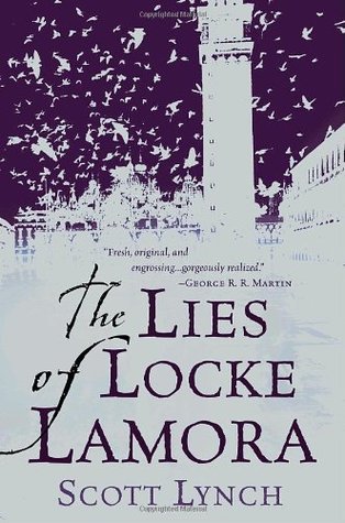 This is the offering produced by Bantam Spectra in July 2006 is an evocation of a setting like St Mark’s Square in Venice, complete with the pigeons. The clean two-tone design and spare use of colour really works well. I also really like the flourishes on the title font and author name, although I could do without George R.R. Martin’s recommendation crawling across the artwork – I prefer such chatter on the back cover.
 This cover, also produced by Bantam Spectra in June 2007 is far more lush with a gorgeous use of colour and giving us a representation of our young thief and his imagining how he will scale the high tower as he sits surveying the skyline. This design has even managed to tidy up Martin’s blurb, while keeping the attractive title font.
 This cover design produced in February 2007 by Gollancz is once more in a Venetian-type setting, though there are clear differences. The buildings are piled far higher and there is a more chaotic atmosphere. The dark green water gives a sense of danger and I think the title font works really well against the darker background. This is my favourite.
 This effort was produced by Del Rey in June 2013 once more gives a sense of a crowded city where the buildings are all piled upon each other. The detailing in the artwork is far more masked by the title, author name and other blurb crashing through the image, which is a shame, as it is yet another beautiful and effective depiction of the book.
 This is the audio CD edition produced by Tantor Media Inc in May 2009. While the building featured is rather crude and simplistic in comparison to some of the other covers, I do like the face superimposed in the sky and the placing of the title font and author name has been well thought out. Another effective, attractive effort.
Once again, I don’t think there is a wrong ‘un in amongst this selection, though the most successful is the third offering in my opinion. Which one is your favourite?

All are really good looking covers but as my personal favourite I have to go with the same choice you made, and choose the Gollancz one.😀
I think it just ticks all the boxes… And also reflects the mood of the book really well.
The Gollancz cover is just beautiful , sadly i have the copy of Bantam Spectra in June 2007 , which is good to look at , but not as good as that Gollancz cover
Yes, it’s always a shame when you have a copy of a book with an indifferent cover. Still, the good news is that between those covers, it’s still a stormingly good read:).
It’s really interesting to see the different covers a book has. I try not to judge a book by its cover but have to say that if I saw this with the Gollancz cover I’d pick it up to read the synopsis. The other covers are lovely but they don’t draw me to them quite as much.
Yes – none of the other covers are bad, but that particular one also particularly speaks to me. I think it’s that otherworld atmosphere it manages to capture.
I think the green one is my favorite as well, I believe it’s the cover of the paperback I own. Great choice!
Thank you Tammy:). Have a great week-end.
I have to say the first cover is the best for me. It feels less loud and busy than the others.
I don’t think there’s a dud amongst this selection, so then it always comes back to personal preference and one of the reasons why I so enjoy taking part in this one is to see who likes which cover:).
I agree with you. But the first cover is a close second for me.
Yes, this week it was a far closer run for me, too as I don’t think any of the covers are plain bad.
I think I like the second and third ones best–something about the blending of the mysterious combination of colors. They just appealed to me more than the reds and oranges of a couple of the others–too glaring, too sunny. I am going on appeal of the visual because I am totally unfamiliar with the content of the book.
And in this case, Rae, all the covers in some way refer to the content so that isn’t an issue. But the more muted colour palette is certainly effective.
So I guess it’s a good sign that since all these covers intrigued me, I couldn’t help but check this book out at the library. 🙂 While you’re right that all these covers have strengths, I’ll have to say the weakest is the audio version. It just makes me think of a postcard castle cut out and pasted onto the page. The elements just don’t blend like the other covers do, is what I think I’m trying to say.
I look forward to hearing what you make of this one – it was one of the forerunners of a new sub-genre in fantasy. As for the covers… yes, I suppose you are right – there isn’t the complexity and detail in the audio version, is there?
When compared to the others? Not even close.
A NEW sub-genre? How many sub-genres do we need?!? Gah! Diana Wynne Jones lamented the genre plague in the…was that essay from the 90s? I can’t remember. All I know is that if it was a problem 20some years ago, then I cannot comprehend the scale of subgenres now….
It probably was the 90s… And yes – you’re right – sub-genres have grown like Topsy since then. Sadly, when submitting, I find I’m having to grapple with such beasties in order to give agents and editors an idea of what I’m offering.
The third one is gorgeous. Even the Martin’s recommendation doesn’t stick out too much.
That was one of the reasons why I fell for it quite so hard for it:).
I think the artist did it on purpose 🙂
I think you’re right:)
I love the green cover – it’s just captivating. I have the top cover – I like it – but that green!
Lynn 😀
It is gorgeous, isn’t it?
I think I’ve seen that first cover around a few times. I often see quotes on the front cover like that, it doesn’t really bother me too much, but I would prefer them inside the book or on the back. It always makes the cover feel a bit more cluttered when extra text is added. I think the second cover is my favorite with the vibrant colors and the interesting looking city scape.
Yes, those quotes do certainly clutter it up, don’t they? And that second cover is very well matched to the story, which I particularly like.
I like the 3rd and the 4th the best: they give the Venetian-like, fantasy feel (the third is definitely my favorite), though the first one is not bad either. The other too feel like they missed the “feel” of the story and were a “quick, the dealine is tomorrow!!!” attempts.
Lol… I hadn’t thought of it like that:). But I always think a cover should reflect the mood and subject of the book and as you say – those ones you picked out do that job particularly well.